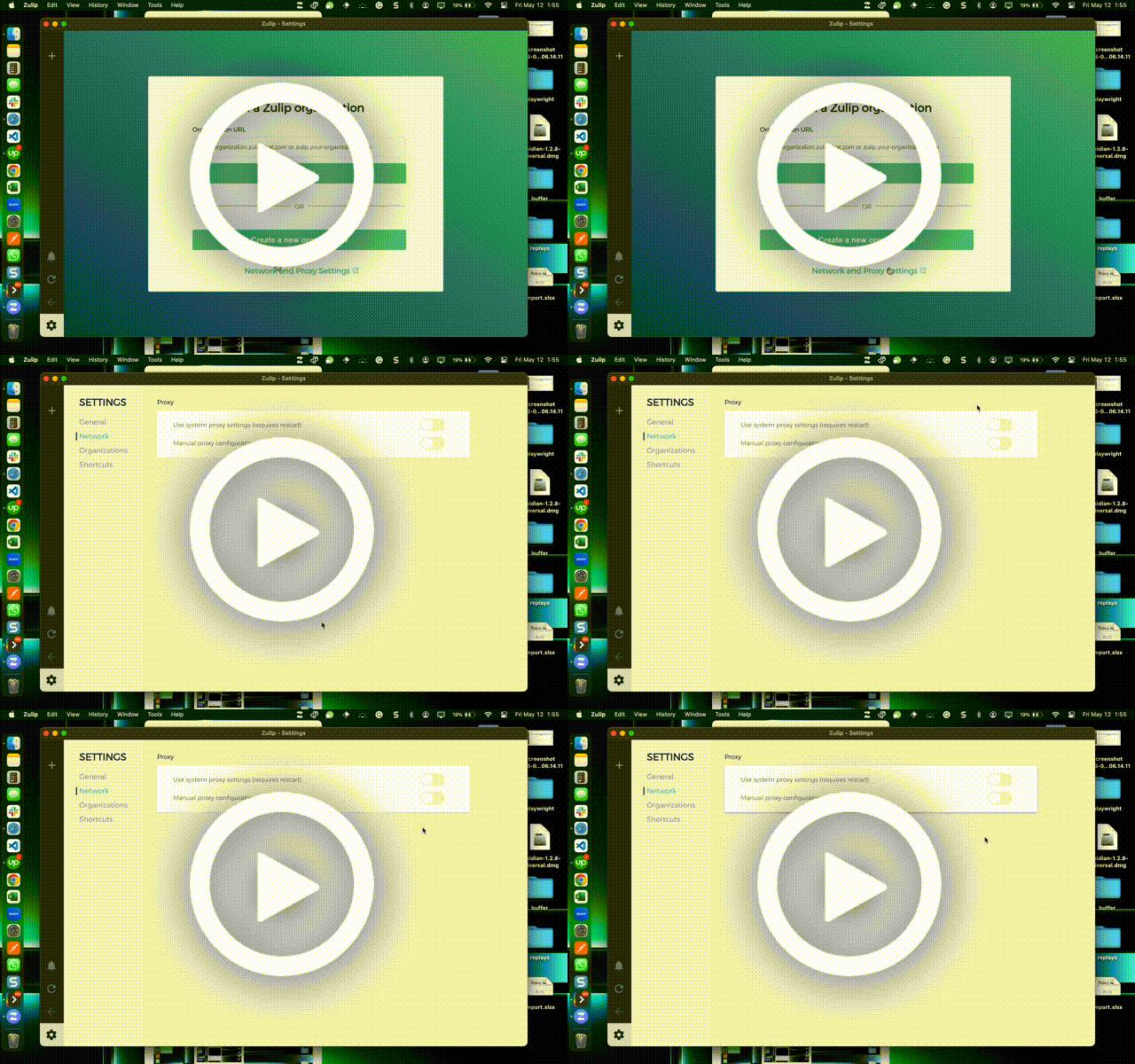
What went wrong?
This is not a bug, it is a suggestion to enhance the toggle switch background color for better visibility. Presently, they appear to blend into their surroundings or lack prominence, making them prone to being overlooked.
Dashcam Clip
Watch Dashcam - New Clip on Dashcam
